|
The goal of this blog has been to reflect on this year's learning, and to add to my understanding and knowledge of game design. I'm not quite sure it's accomplished the latter, but it's certainly accomplished the former. This blog has given me an opportunity to look back over what I've learned this year and made sure I didn't forget things as soon as each unit ended. And I suppose this blog has helped me increase my understanding of game design, especially when we were learning about color theory. Another benefit of writing this blog is that I have been able to organize my thoughts and gain an idea of how I really feel about my potential future career. Overall, I think the experience has been successful.
0 Comments
So far I've completed a slew of 3ds Max tutorials and one independent project, and I think my favorite part was learning to use the various tools that 3ds has to offer. 3D modeling has proven to be fairly easy for me, and quite enjoyable. I really like the fact that there's so many ways to manipulate the shapes, especially the modifiers. I love how it's possible to make such complex models from basic primitives, and it really isn't that difficult if you know what techniques to use. I don't have much of anything negative to say, other than a couple complaints about the program itself. One of my models didn't save properly once, and another time I couldn't get a texture to render properly. In terms of modeling, I wish I could Undo more than 10 times. Other than that I don't think there's much of anything I really dislike about 3D modeling. I think I enjoy working with it it more than making 2D artwork, partially because it's possible to create more much complex scenes more easily, and partially because I simply like the process more. 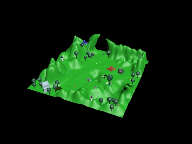 I'm quite proud of this project. I really like how it turned out and it was fun to create.
Of all the tutorials I've done so far in our 3D modeling unit, I think the most useful has been the Modeling with Sub-Objects tutorial. Using primitives is one thing, but using sub-objects takes models from crude building-block shapes to real creations. Just about every model I've made since this tutorial involved using sub-objects, and I'm sure I'll be using sub-objects a lot in the future. It's a fundamental skill of using 3ds Max.
Having just started working on 3D modeling in 3D Studio Max, I'm not really sure whether or not I'm going to like it. It's definitely interesting. Based on my limited experience, I think overall I'm going to enjoy it so long as my projects don't crash and burn. So far I've made exactly one thing.  It's supposed to be an elephant. An elephant with really, really long ears, which I'll give the story behind later. My thoughts:
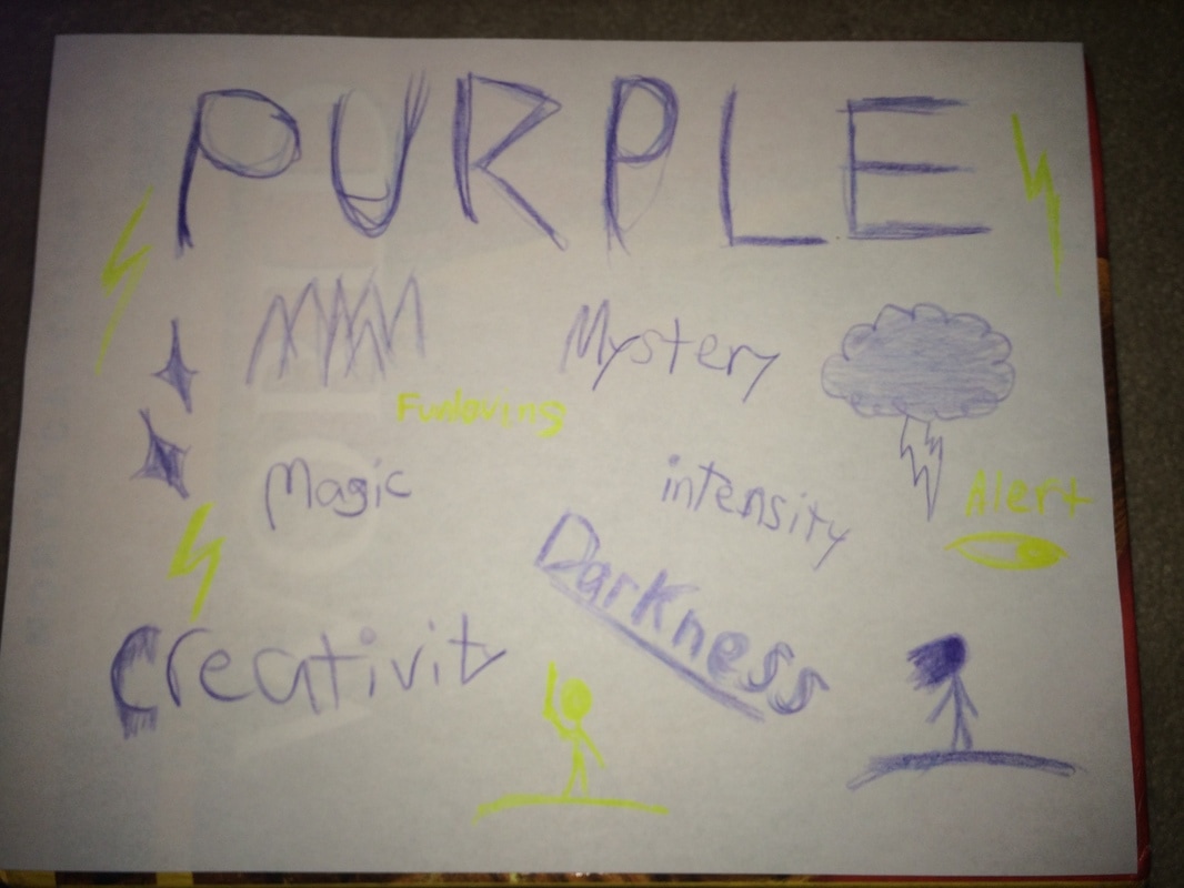
I definitely like having the ability to create my own 3D objects, which is something I've tried to do before in real life using clay and failed at, because I'm bad with clay. However, this seems like something I'll actually be able to do. I like how specific I can get with editing a single shape, without having to tack on other shapes. The program seems easy to use in general and there's a lot of different options. I'm already getting used to the controls, and I look forward to discovering the full scope of what I can do with the program. It seems really easy to make highly specific changes and pinpoint exactly what I want to customize. I definitely like that. I have noticed that it takes some getting used to, though. I was trying to turn the elephant's ears downward, because they were sticking up in the air before, and they kind of freaked out. They kept turning at really weird-looking angles and clipping into the head, and though I tried to fix it I could only do so much. I noticed that it was mostly when I tried to move them on the z-axis that they started behaving oddly. They ended up being really long, because any attempt to move them up off the ground made one ear go straight into the head and the other stick out to the side. I don't understand why exactly that happened, but I guess that once I get used to the program I'll be able to fix (or prevent) things like that. Use of ColorFrom the website 99 Design I learned that humans see in RGB color, that no one device can reproduce every visible color, and that technically, color is all in your head. It's just how we perceive different wavelengths. I also reviewed some information about color models and color schemes. From the website Color Matters I learned about color meanings and that color can influence emotion, appetite, and blood pressure. It's especially important in advertising, because the point of advertising is usually to convince someone to buy something from you. To do that, you often have to manipulate people. Color is used for communication. I must admit, however, there have been times when I read what certain colors are associated with and was quite surprised to find ideas that had never once crossed my mind. In addition, some colors have different meanings in different cultures, so it seems to me that it depends on your perspective. Color and PersonalityAccording to the Hartman Color Code Personality Profile survey, I am a yellow personality. I was surprised by this, because I don't like the color yellow. Apparently, yellow personalities are fun-loving, persuasive, playful, and alert. I think that sounds like me. Apparently, yellow personalities are also optimistic, happy, carefree, and highly sociable. I'm fairly certain that doesn't describe me. I also looked at descriptions of "personality colors" on the website Psychologia. Before I get into detail about the color descriptions, I would like to point out here that the article says that Hartman's color codes "have nothing to do with color psychology." Of course, it's important to mention that the Psychologia article also says the information is provided for entertainment purposes only, and that "color psychology is not exact science." With that said, I'll get to the results. Interestingly, Psychologia's description of the color yellow was something I could definitely relate to. What made this interesting was the following quotes from the website: "According to proponents of color psychology your favorite color (or colors) define your personality color" and "colors you choose say a lot about your physical, mental and emotional states." But what really caught my attention was this: "Similarly, colors you dislike tell a lot about your weaknesses and vulnerabilities." As I said before, I don't like yellow, but that was the color that described me best, at least according to Psychologia. My actual favorite color is purple, but since the website had no descriptions of the color purple, I examined the descriptions of red and blue. They contrasted each other quite a lot, and while I could see a few details in each that sounded like me, they mostly didn't fit me. I also looked at the description for the color black, because while it's not my favorite color, it's in my top few. That description was more relatable. So as far as I can tell, my personality is a dark yellow color. I find this amusing, because according to the website Color Matters, there is no such thing as a dark yellow.
 In this Atari game advertisement, two main principles of design draw the viewer's eye to the apples. One is principle of movment. The red streak behind the apple creates a line that guides the viewer's eye straight to it, and gives it a sense of motion. The emphasis is also placed on the apples due to the color. The red and white colors contrast with each other and the blue background. The image is almost the same on either side, which gives a sense of balance. This is also an example of repetition, as is the repeated use of one font in the text below the image. Over the past week, I've learned the principles of design, while also learning how to use various Photoshop techniques. I have definitely gotten a lot better using Photoshop. I loved using the layer style options. I was quite impressed by the amount of control I had over how the image was affected, using only a few sliders. I think the tool was very useful. However, trying to demonstrate specific design principles under time constraints, especially when I could only manipulate someone else's art instead of creating my own, was really difficult for me. I don't feel like I was able to come up with good examples of each principle. The one I struggled with most was movement. I couldn't think of to use drawings of orcs, trees, and treasure chests to guide the viewer's eye to the focal point, other than to just put a bunch of them in a line. All in all, going in depth with Photoshop was a great experience, but I don't think this was much help in learning the principles of design.
Of all the sensors on the TI SensorTag, I think the most interesting is the barometric pressure sensor. It measures the pressure of the atmosphere's weight. I personally think it's interesting to know how much the air is weighing on you. One way to use the sensor for an on-campus experiment would be to take readings at on different stories of a building to see if there's a measurable difference. To make the differences in the data more obvious, the readings would be put into a spreadsheet and averaged for each floor, then put into a column chart. Here's an infographic I made about sensors:  As a student, data visualization is important to me both when researching and presenting. When I'm researching for a project or paper, it saves me a lot of time if there's a chart or graph. I don't have to look through the entire paper just to find the statistics. This is also the case with presentations. Chances are, people would rather come look at a chart rather than a big chunk of text. In addition, statistics are harder to process and understand if there's only raw data, but visualization makes it a lot easier to make an impact.
If I was to use data visualization to make a change to the school, I would try to get recess implemented at DSA. I would need to do an experiment on how effectively students function with and without leisure time. I'd put the results of both groups on the same graph to emphasize the difference, and if it was a big enough difference, hopefully it would be taken into consideration. Copyright laws are a really important protection for people who make money off their creative work. If someone works as an artist of any kind, having other people make money off it or take credit unfairly can be really damaging. Essentially, it protects people from stealing their business without actually doing any work. However, this can limit artist's freedom, because they could infringe upon something by accident and get fined. It can make derivative works risky, because of the reason just mentioned. Personally, I wouldn't suggest a change to copyright laws, because it's a delicate business and I think it's good enough how it is.
|
AuthorI'm moving on to my 4th (and final) year as a Game Art & Design student at Durham School of the Arts. I'd like to call myself an artist, but I'm a programmer at heart. Archives
February 2020
Categories
All
|

 RSS Feed
